
When someone is choosing an NDIS provider, they're not just comparing services. They're deciding who they can trust with something deeply personal. NDIS provider branding is how you earn that trust before anyone picks up the phone.
Most providers are good at what they do. The problem is that their brand doesn't show it. A logo made in a hurry, a website that looks different from the brochure, and a Facebook page that hasn't been updated in months all send the same quiet message: "We might not have it together."
Three people are judging your brand at once
NDIS providers have a harder branding job than most businesses, because three different people are making the decision.
Participants
Want to feel safe, respected and understood. They look for warmth, plain language and real people, not stock photos.
Families and carers
Want to feel confident their loved one is in good hands. They look for professionalism, clear information and signs you're established.
Support coordinators and plan managers
Want to refer to providers who make them look good. They check whether you're easy to understand, easy to contact and consistent everywhere they find you.
A strong NDIS brand speaks to all three without trying to be everything to everyone.
The five trust signals that matter most
A clear, simple message. Within five seconds of landing on your website, a visitor should know who you help, where, and how. If they have to scroll to work it out, many won't.
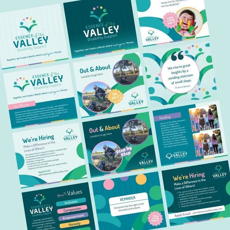
Consistency everywhere. Your website, social media, flyers, email signature and service agreements should look like they came from the same business. Inconsistency reads as disorganisation.
Real faces and real stories. Photos of your actual team and genuine testimonials build more trust than any stock image.
Easy next steps. One obvious way to make contact: a clear button, a phone number, a simple form. Don't make people hunt.
A professional logo and colour palette. Your logo doesn't need to be clever. It needs to look established, calm and easy to recognise at a glance.
Signs your NDIS brand is holding you back
You find yourself explaining what you do over and over.
You hesitate before sharing your website with a support coordinator.
Your logo was a quick fix when you started and never got replaced.
Enquiries are slower than the quality of your service deserves.
If two or more of these sound familiar, your brand is probably costing you referrals.
What good NDIS branding actually includes
Good NDIS provider branding starts with strategy, not design. That means getting clear on who you serve, what makes you different and what your audience needs to feel before they reach out. Only then does the visual work start: logo, colours, fonts, photography style and a website that brings it all together.
That's exactly how the Brand Growth System works. It moves through three phases, Clarity, Trust and Consistency, so your brand and website work together to bring in the right enquiries.


Where to start
Not sure how your brand measures up? Take the free Brand Clarity Scorecard to see where you stand in five minutes. Or learn more about branding for NDIS providers.
Ready for a brand that support coordinators are proud to refer to?